
Downtown, Los Angeles
Group Exhibition
The Pink House (Jan. 19 1995)
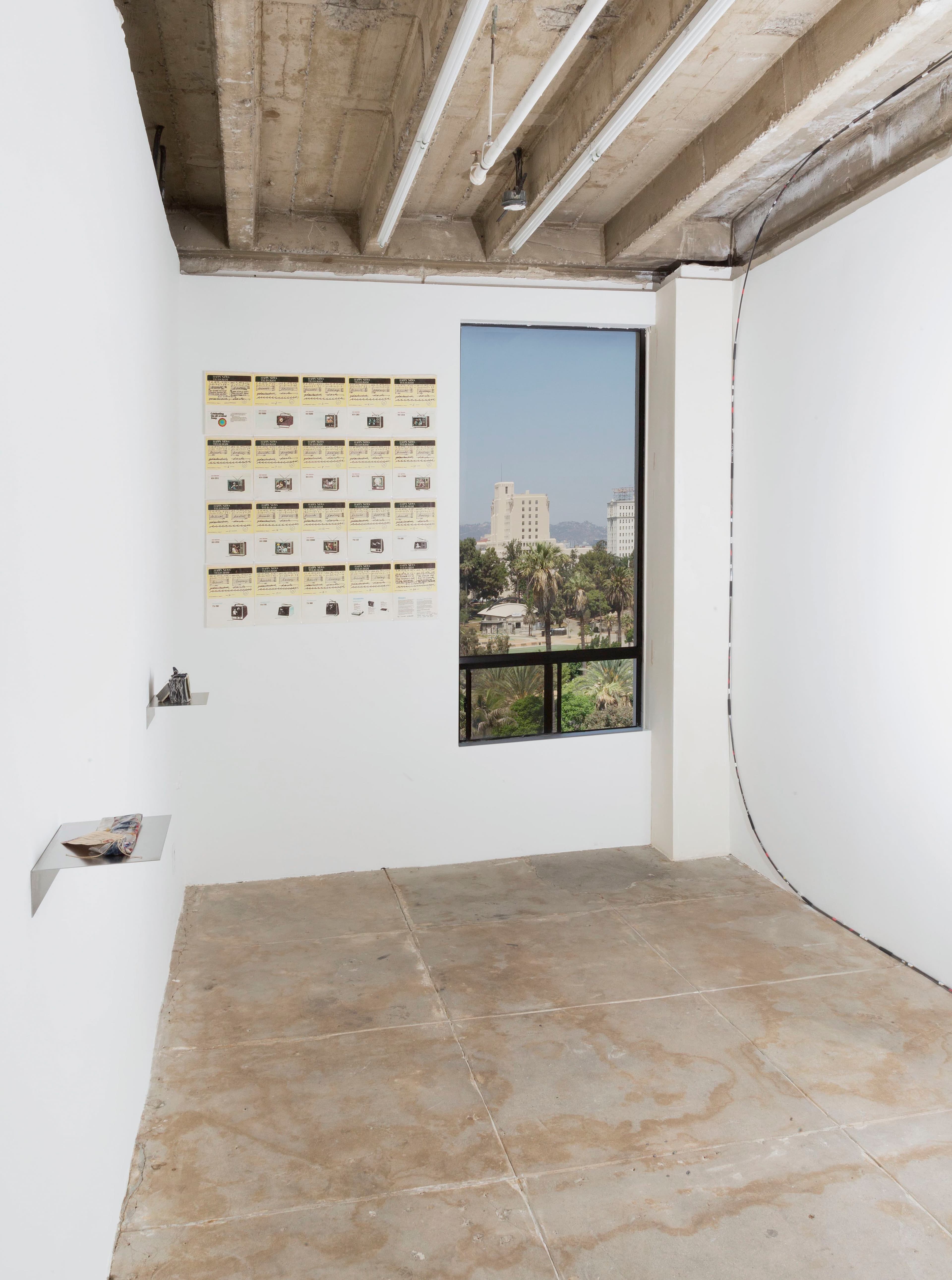
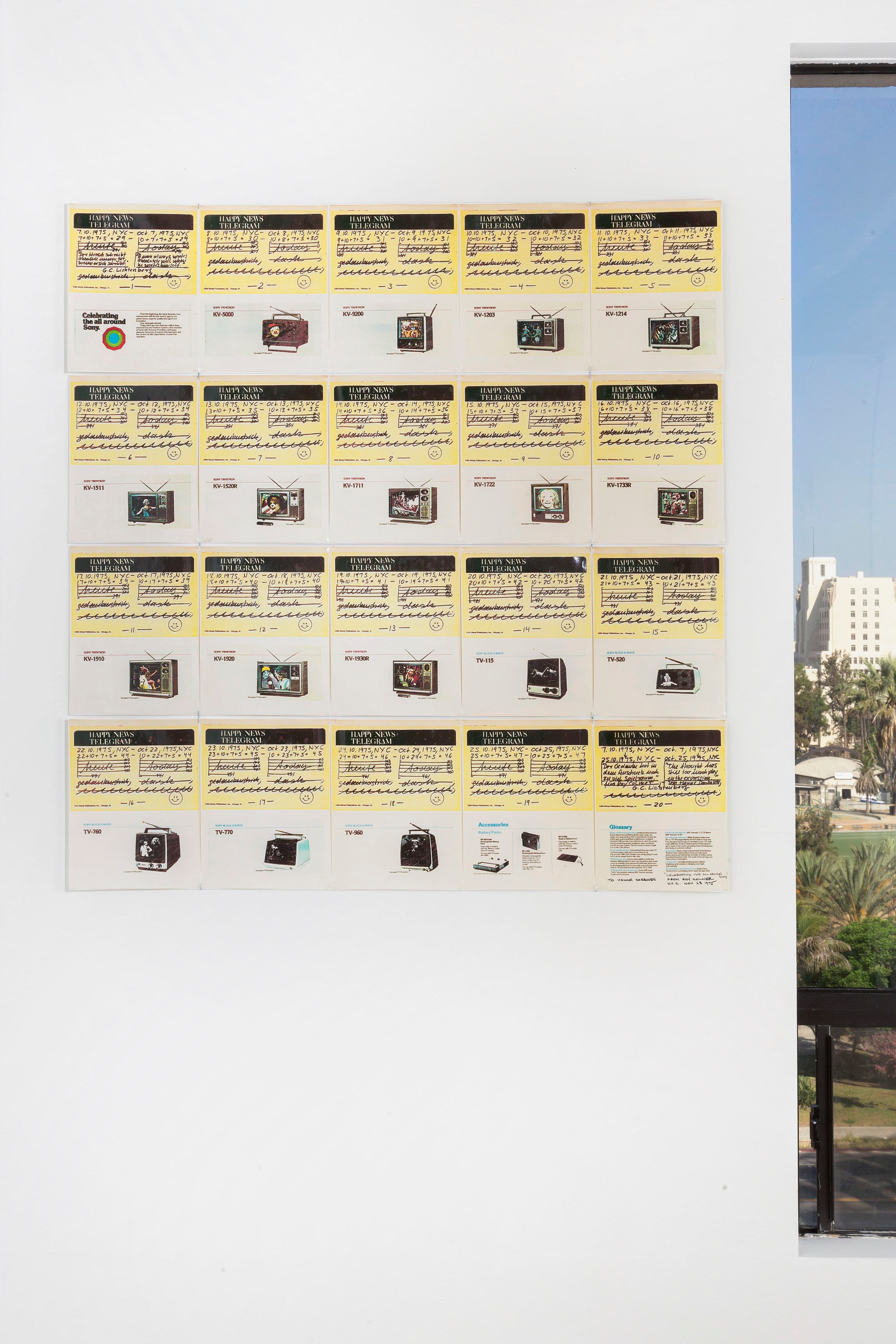
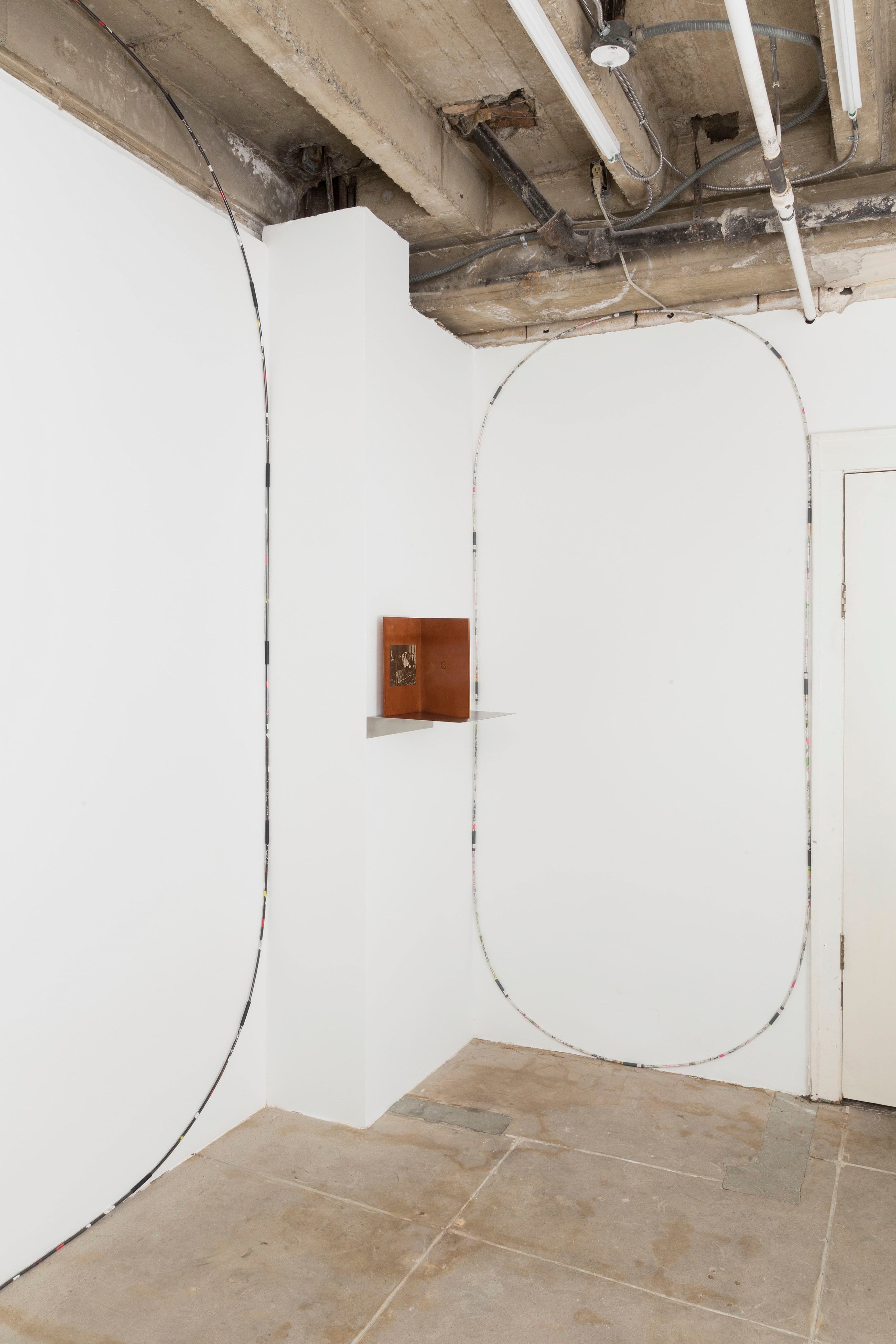
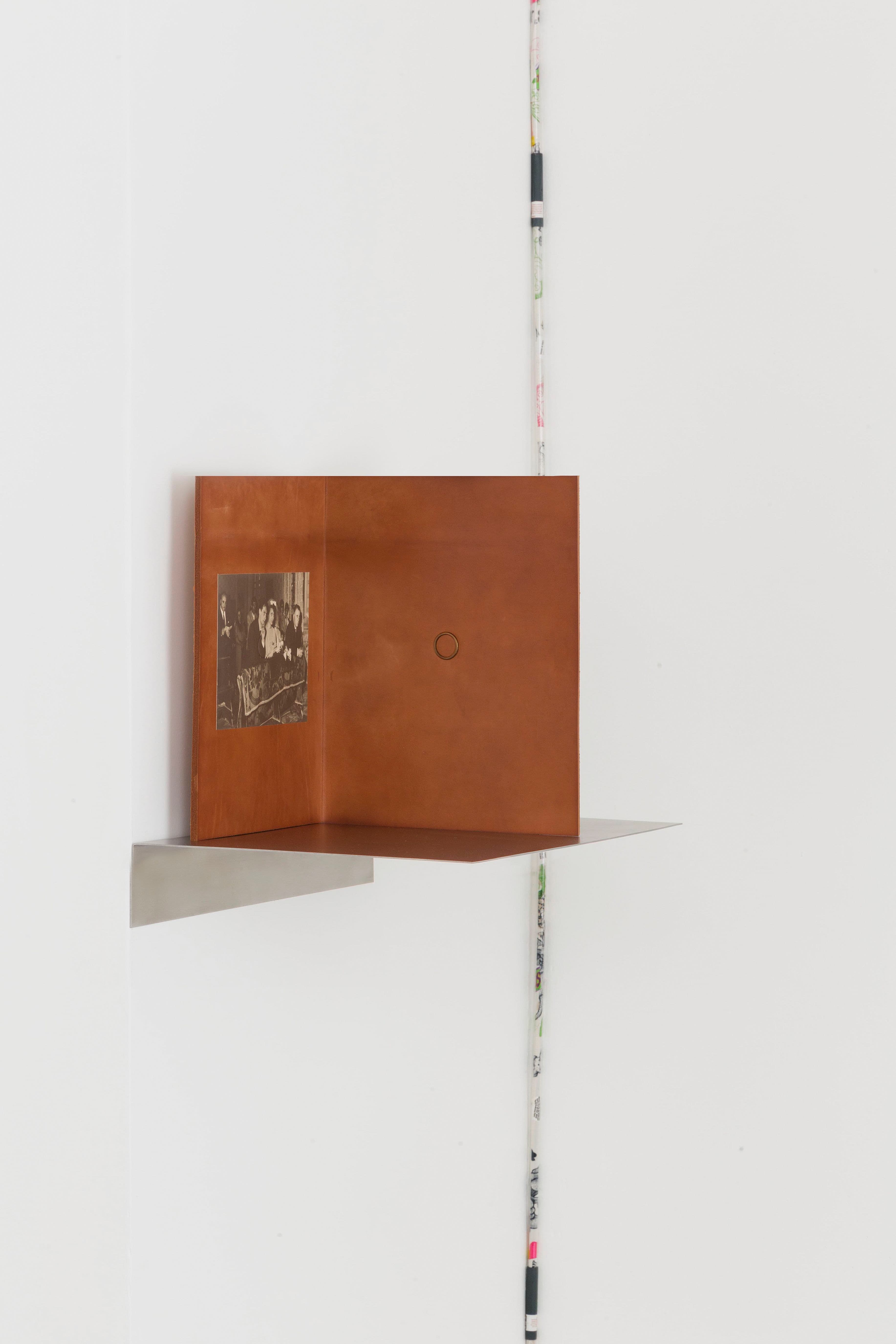
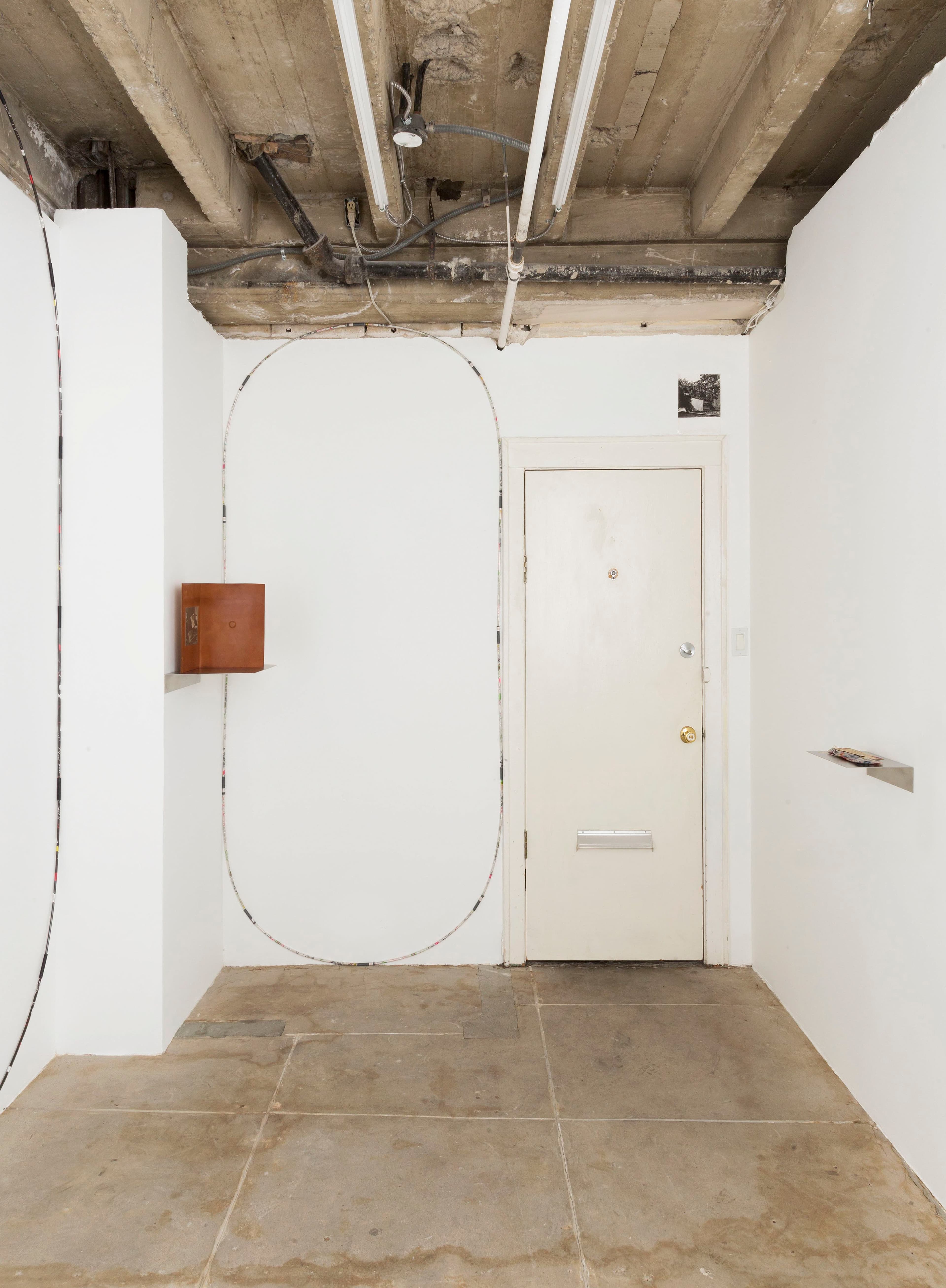
Bad ReputationDaniel Buren Hanne Darboven Luciano Fabro Ray Johnson Chadwick Rantanen Robert Watts In 1969, Ray Johnson purchased a house at 44 West 7th Street in Locust Valley, NY 11560, which he named The Pink House and also 100 Swans. The house was first painted pink and later gray, though still called The Pink House. On January 19, 1995 the Sag Harbor Police Department arrived at 44 West 7th Street, Locust Valley, NY 11560 and taped their entry into The Pink House. Daniel Buren, Peinture suspendue, 1972, is an example of Buren’s Photo -souvenirs of site-specific and temporarily installed works. The site-specificity is contingent on the context and non-permanency of Buren’s work as it exist in situ. Buren claims that his photo-souvenirs are not copies but rather artworks existing as tools that help to remind one of a past event. [1] Buren’s ideas of subtracted souvenirs function towards the ideas of the label in his work Les formes: peintures at the Centre Pompidou in Paris, 1977 which specifies the idea of artwork as a tag or label further: Les formes is defined as follows: a number of paintings from the permanent collection of the museum is to be selected by the curator(s) and to be designated for the inclusion in Buren’s installed work. A rectangle of Buren’s standard striped canvas material is cut to the exact dimensions of each of the chosen framed paintings from the permanent collection and attached to the wall behind the painting. Buren’s element is not visible upon frontal observation of the painting and only slightly discernible upon closer inspection of the side of the painting where the thin edge of the striped canvas is congruent with the frame. A third element of this installation, however, alerts the viewer to the existence of a second work within the apparently unaltered presentation: a label underneath the painting’s usal label, which informs the observer of author, title, technique, and date of the painting, now additionally informs the viewer of those same ate for Buren’s piece inserted underneath. The two labels initiate a visible dialogue between two (art) historical phenomena, a present-day work that is literally about to position itself in the place of its historical predecessor, and a historical work that is superimposed on a present-day aesthetic reality. [2] The Photo-souvenir shows a square cut striped fabric attached to a rope. The silver gelatin photograph is printed at a similar ratio square on a rectangular photo paper, leaving a stripe at the bottom of the print, unexposed. A tag in a tag in a tag (in a tag?). Hanne Darboven, Celebrating The All Around Sony (Color), 1975; is an edition of 20 Xerox color prints made in collaboration with Roy Colmer. Dec.3, 1975, am burgberg — dear roy— this letter i sent to adrian — roy— and i do send to you these 9 pages — ‘Found objects in NYC’ /B/W. I guess/ i think — that is fine— you did these 9 pages in 2 forms — i take the freedom to put the second form out — the same with 1 page ‘Found Objects,...Color’ so: now: 4 works: each work of 20 pages Roy Colma/Hanne Darboven — dear Roy — i think : Adrian will show this work in Jan, 1976 — oh — roy— so you see which pages we have together: therefore i do send these 9 pages — therefore i do send this 1 page to you that you know -— Roy — that is great — hope all is well in NYC — will write soon — Love Hanne, it is late; it is early; dash; Dec 3, 1975, am burgberg. [3] Luciano Fabro, Vera, 1969; inside a leather bound folder on one half is the wedding picture of Luciano Fabro and Carla Furlanis. On the other half, in an indentation in the leather, is a golden wedding ring, the inside of which bears the artist’s signature and the date of the wedding, May 29, 1960. The work is editioned at 250. Ray Johnson, One Dollar Bill Series, 1969. One dollar bill - SERIES 1969 B, blue denim fabric tied by band of denim, correspondence to Ed Plunkett, NYC [4] , was first exhibited in an exhibition of collages including single one dollar bills at Richard L. Feigen Gallery in 1970. Johnson is the founding member of The New York Correspondence School (1962). The first Correspondence Art consists of a compression of ideas and images into envelopes, in a conceptual art- fashion, fitting things to fit envelope sizes and folding things to fold into envelopes....I dealt with things that are constantly chopped up and shuffled and moved around...that is why I began putting things into envelopes”....”what does one do with one’s sculptures or one’s paintings or drawings? ...so I have solved that problem by chopping them up into little pieces and mailing them to people.” [5] A similar logic of segmentation or fragmentation can be observed in Johnson’s almost (sculptural) organization of space “...you walk into the house and the first thing you notice is that there are shelves built from the floor to the ceiling and in these shelves are boxes that are stacked neatly.” ...in the living room which was basically his studio alongside a big table was an air mattress which doubled as his bed because the whole house with the exception of the bathroom was literally all shelves filled with Ray’s work. [6] and his apartment was totally bare, except for a stack of books up to the ceiling and one rope across the room...when asked what the book stack and the rope were for, Johnson replies the stack of books holds up the ceiling and the rope was there to divide the room. [7] Another consideration that is significant here is Johnson’s practice of establishing a value for his work. Oftentimes associated with modes of fragmentation or addition to (re-) negotiate its value he [Johnson] suggested me to write him a letter of what I could spend. ... the next time around was a couple years later and there was a collage I really liked, this round collage it was a portrait of Andy Warhol and he wanted two thousand for it and I offered him fifteen hundred and he took everything back home and sent back the collage with the bottom quarter cut. He had cut out $500 worth out of the collage. [8] Chadwick Rantanen, Loop (Brave is Easy) and Loop (Minnie in Love), both 2014. Each loop contains 50 segments. Suspended within each segment is polyester and cotton fabric from a nurse smock. These strips of fabric are wrapped around a carbon fiber rod and then inserted into a butyrate plastic rod. These rods are then connected to each other by steel ferrules which have been powder coated a matching color to that of the fabric. Each segment possesses 2 tags. One tag is foil stamped on acetate and is a replica of the original tag which accompanied the fabric. One tag is inkjet on polyester and outlines all of the materials used in the loop. Each segment also possesses at least 2 labels. The labels are laser or inkjet prints on paper or plastic and contain safety warnings, assembly and disassembly instructions and a model number, such as “CRLO14 #27 of 50” which indicates that this particular segment is the 27th of 50 of Chadwick Rantanen’s 14th Loop piece. There are occasionally additional tags which possess no text only corresponding colors. The circumferential dimensions of a loop is dependent upon the size of the wall which holds it; a larger wall will require more segments. The shape of the loop is dependent upon the shape and character of the wall which holds it. [9] The fabric as merchandise inherently represents the systems and various agencies involved in producing and distributing it. It also represents the institutions which appropriate the self enforced and culturally assumed codes associated with the copy-written material of cartoon characters and pattern designs imprinted on the fabric. The cartoon characters act as a signpost or marker, in that there is an understanding of what these characters usually look like/do or should look like, and the way they have been appropriated to enforce or assist the codes of the design and the systems they operate in. The characters remain recognizable because familiarity aligns with the general concept of these unregulated codes. Robert Watts, Yam Festival, 1962, Untitled [unopened plastic bag]; Printed stringed tag addressed Watt's (sender) and E. M. Plunkett (recipient), tag affixed to a printed, color, plastic bag sealed with cellophane tape - contents appear to be a toy metal shovel with a stringed tag, addressed to E. M. Plunkett, postage stamp hand canceled with no legible postmark date. [10] With the generous support of the Michael Lowe and Kim Klosterman Collection, Cincinnati, Ohio. 1 - M. Lowe (Personal Communication, August 3, 2018) citing online blog entry by knoetgen@uoregon.edu: https://blogs.uoregon.edu/danielburen from March 11, 2015. 2 - Benjamin H.D. Buchloh, Neo-Avantgarde and Culture Industry, Essays on European and American Art from 1955 to 1975, p.133. 3 - Hanne Darboven, Letter to Roy Colmer, part of Certificate of Celebrating The All Around Sony (Color), 1975 4 - Michael Lowe, Collection, 2018. 5 - Ray Johnson, The Sampler, Nicholas Maravell. 1987. Video Recording (1 of 5 sessions). Recording later appeared in: How To Draw A Bunny, John W. Walter, Andrew L. Moore, 2002. 6 - Sag Harbor Police Dept., Interview, How To Draw A Bunny, John W. Walter, Andrew L. Moore, 2002. 7 - James Rosenquist, Interview, How To Draw A Bunny, John W. Walter, Andrew L. Moore, 2002. 8 - Peter Schuyff, Interview, How To Draw A Bunny, John W. Walter, Andrew L. Moore, 2002. 9 - Maxwell Graham, Chadwick Rantanen, Loops and Bins, Essex Street, NY, NY; Press Release, May 5, 2013. 10 - Michael Lowe, Collection, 2018.